Redesigning a complex transaction workflow
A UX/UI redesign of a multi-step transaction workflow for a B2B advertising platform: from product search and campaign setup to negotiations, document exchange, and settlement. The goal was to reduce cognitive load and help users move through decisions with clearer status, context, and actions.
Project scale
Solutions consulted and tested with four planners doing the same job as the target users, throughout the whole project.
- Product
- Internal platform for planning and selling advertising campaigns, used daily across teams.
- Scope of work
- UX analysis, information architecture, flows, wireframes, and UI design.
From scattered actions to one predictable workflow
- scattered entry points
- unclear status logic
- actions hidden in separate views
- one predictable workflow
- status-driven actions
- context kept visible
A complex system where simple tasks were hard
An internal B2B advertising platform where teams plan and sell advertising campaigns, from entering a campaign, through the basket and the transaction, to negotiations, document exchange, and settlement.
The complexity did not come from a single screen. It came from many roles, process stages, statuses, and data layers stacked on top of one another. The underlying business logic could not be changed, so the clarity had to come from structure, information architecture, and UI.
The project started as a small assignment to improve product search and campaign setup. A UX analysis showed that the usability problems were systemic and spanned the whole transaction workflow, so the scope grew into a broader redesign of the platform.
Statuses did not form a single path. Campaign, product and document each had their own parallel lifecycle, and the user saw them all at once. A product could already be reserved while the campaign was still in negotiation and a document was awaiting signature. The heaviest cognitive load came not from any single status, but from having to fold three layers into one answer to the question: what should I do now.
Off-path states needed their own decisions: a suspended or removed product, a paused campaign. Each had to affect the available actions, and the other layers, in a predictable way.
Where the complexity came from
Users
Process stages
Statuses across three parallel layers
Data
One workflow, not isolated screens
The redesign covered the whole path, from the first entry point all the way to settlement. Different starting points had to resolve into one predictable transaction workflow. In other words, screens were designed as consecutive steps of a single path, not separate places with their own logic.
A scattered process with high cognitive load
- Overloaded screens with weak information hierarchy.
- Inconsistent UI patterns across modules.
- Navigation that required prior knowledge of the system.
- High cognitive load for new and occasional users.
As a result, everyday tasks were slow and error-prone.
Core challenge: How to guide users through a multi-step decision-making process without changing the underlying system logic, with limited access to target users and tight, iterative deadlines.
What users had to figure out on their own
- Where am I in the process?
- What has already been agreed?
- What requires my attention?
- What actions are available now?
- What happens after I click?
A redesign inside hard limits
These limits forced a pragmatic, systemic approach to UX.
Improve decision-making without rebuilding the system logic.
My role: turning complex flows into usable interface patterns
I was responsible for the end-to-end UX/UI process: analysing existing flows, mapping scenarios, structuring statuses, designing decision points, and translating complex business logic into wireframes and interface patterns.
I had no access to the target users on the client's side. So I worked with four planners doing the same job in the same role, from questions about their everyday work with the panel, through reviews of successive versions of the flows, to usability testing of the solutions.
Process artefacts
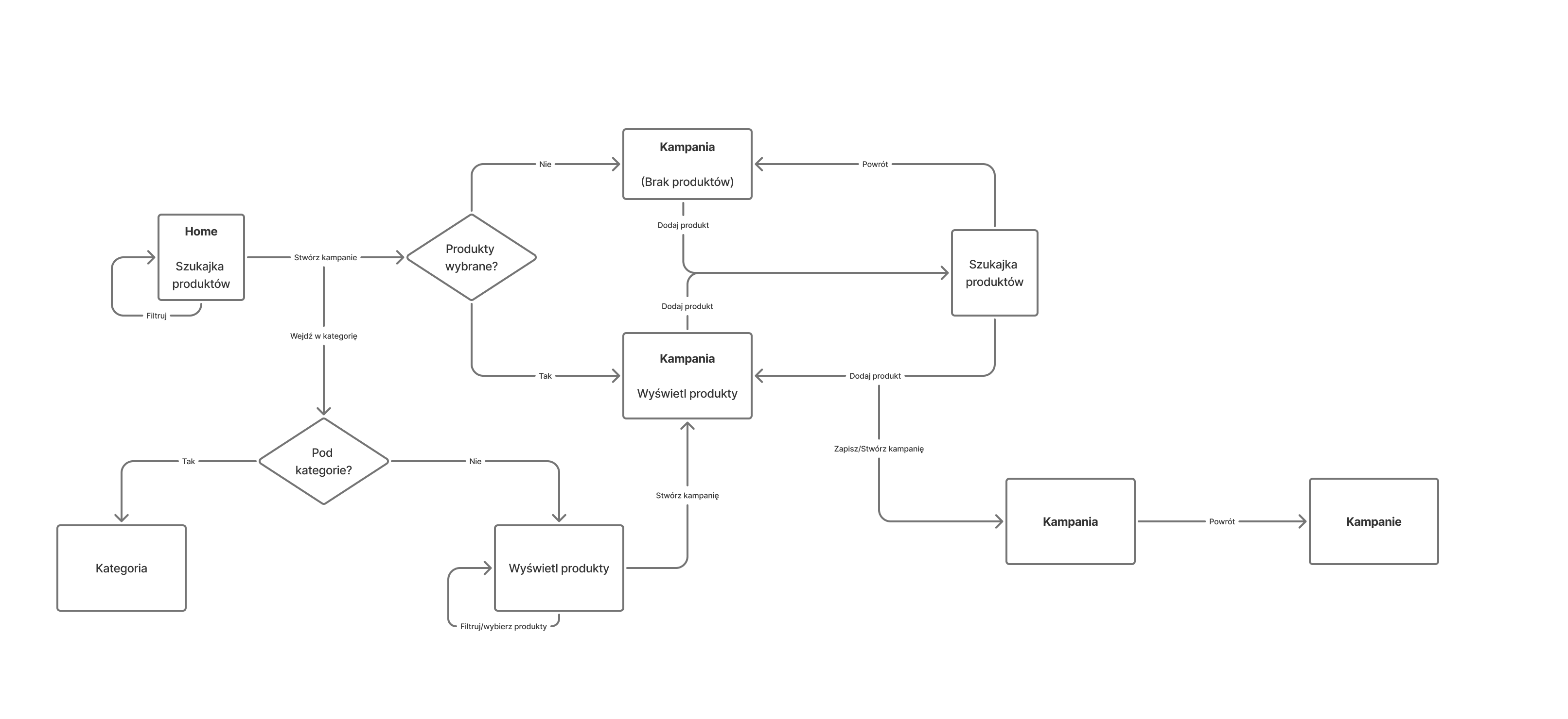
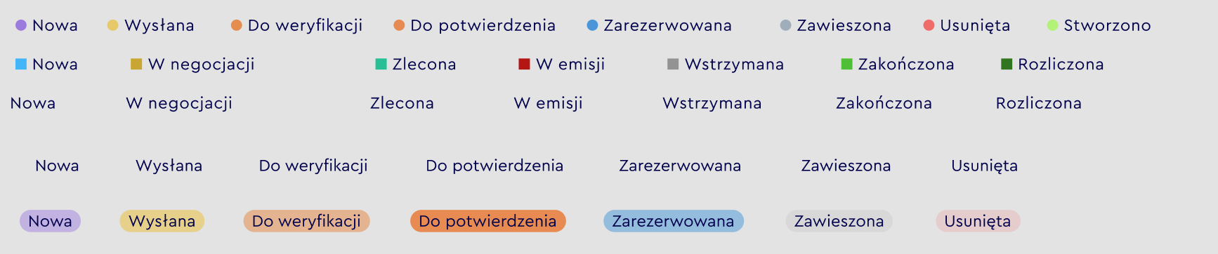
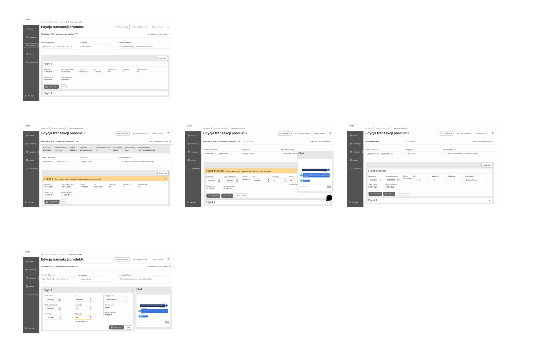
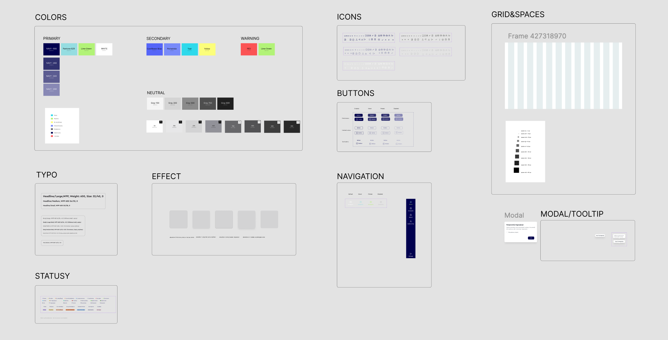
From separate screens to a status-driven workflow
Instead of designing more separate views, I structured the process as a sequence of states and decisions.
Status is not just a label here, but signals what is happening now, which action is available and what the next step will be.
This way the user does not have to interpret the system logic alone, because the interface guides them through the process.
Status guides action
A status is not just a label, it defines what the user can do next.
History is contextual
Separated from the current state and available on demand, it does not clutter the main view.
Campaign context stays visible
Users keep the parent context while editing a single detail.
No duplicated information
One piece of information lives in one place, with fewer chances for error.
Four areas, one coherent workflow
Every area follows the same pattern, problem, decision, effect.
Area A · decision center
The basket as a campaign decision center
Problem: The basket worked as a passive product list, with no hierarchy of status, readiness, budget, or next steps, so users could not tell what needed their decision.
Decision: Turn the basket into a place to assess campaign readiness, surfacing campaign status, product readiness, budget, and a contextual call to action.
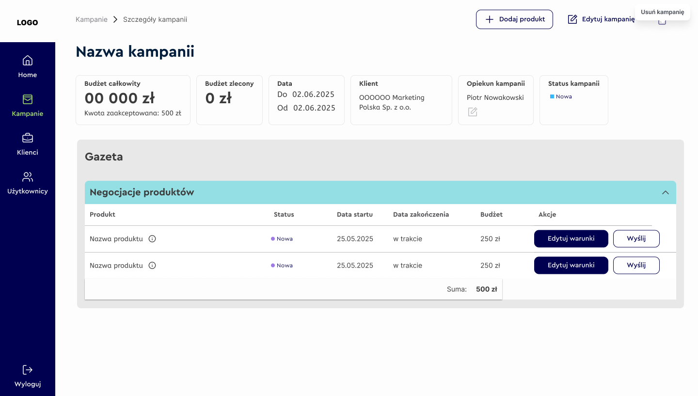
- 1Campaign status
- 2Product readiness
- 3Budget / value summary
- 4Contextual CTA
- 5Products that need a decision
EffectFaster assessment of campaign readiness and a clearer moment to move to the next stage.
Area B · transaction details
Transaction editing without losing context
Problem: Editing happened in separate modals or screens, so users lost the campaign context and the impact of their financial decisions.
Decision: Let users edit transaction details in place, with the campaign context always visible and changes reflected immediately in the summary and status.
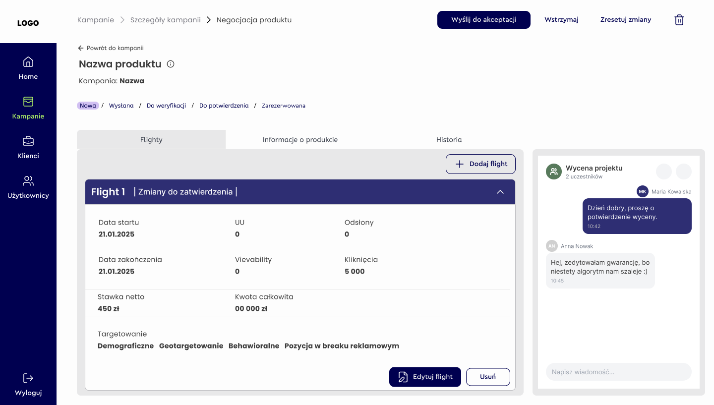
- 1Campaign context stays visible
- 2Edited transaction details
- 3Impact on summary and status
- 4Action depends on the stage
EffectSmoother editing without losing orientation, and lower cognitive load on financial decisions.
Area C · status drives action
Negotiations as a status-driven sequence
Problem: Negotiations and settlement happened in detached modals, so users lost the campaign context and there was no clear sequence between negotiation, documents, and settlement.
Decision: One sequential path where statuses and actions are tied to the stage, blocking invalid and premature actions, while history stays available without leaving the context.
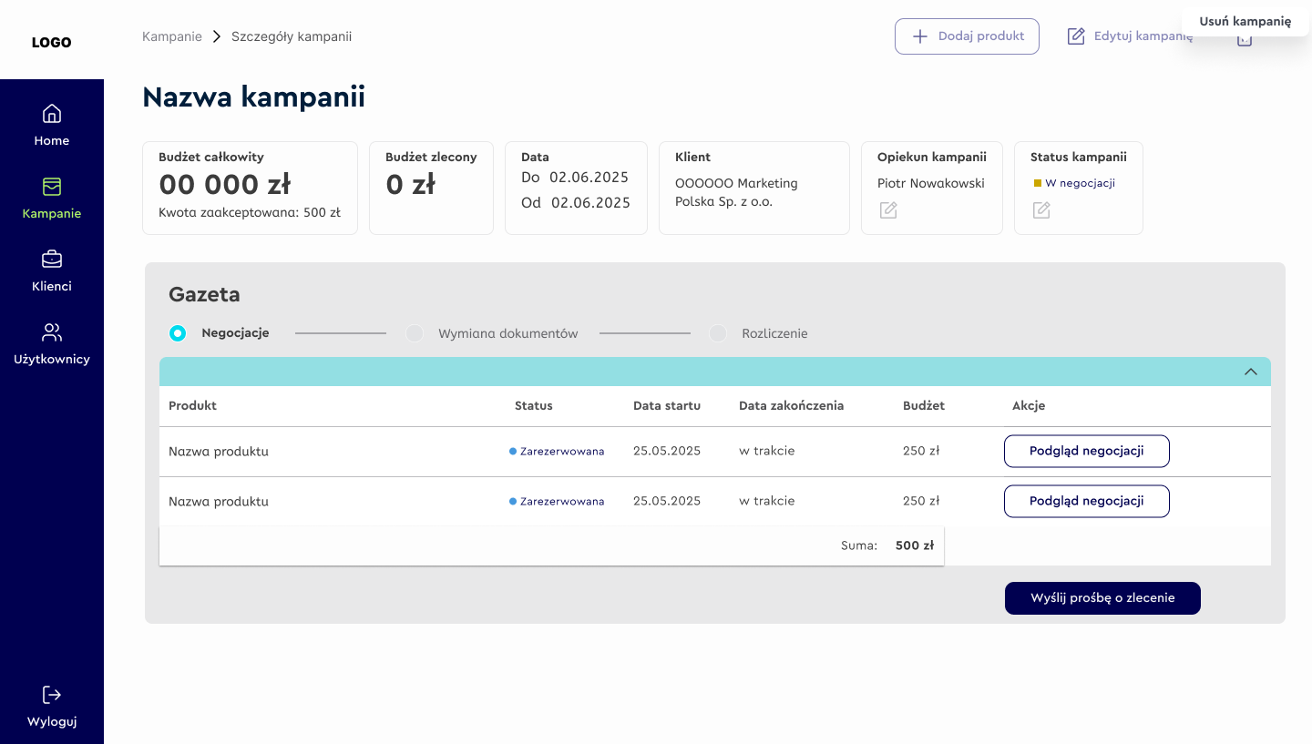
- 1Transaction status
- 2Current proposal
- 3History available on demand
- 4Actions depend on the status
EffectProtection against wrong and premature decisions, with a status-driven flow and less communication chaos.
Area D · current state vs history
Document exchange and history
Problem: History was mixed with the current state, so the main screen was cluttered and it was hard to judge progress toward completion.
Decision: Separate the current state from the history. The main screen supports the current decision, while history lives on a dedicated, on-demand panel.
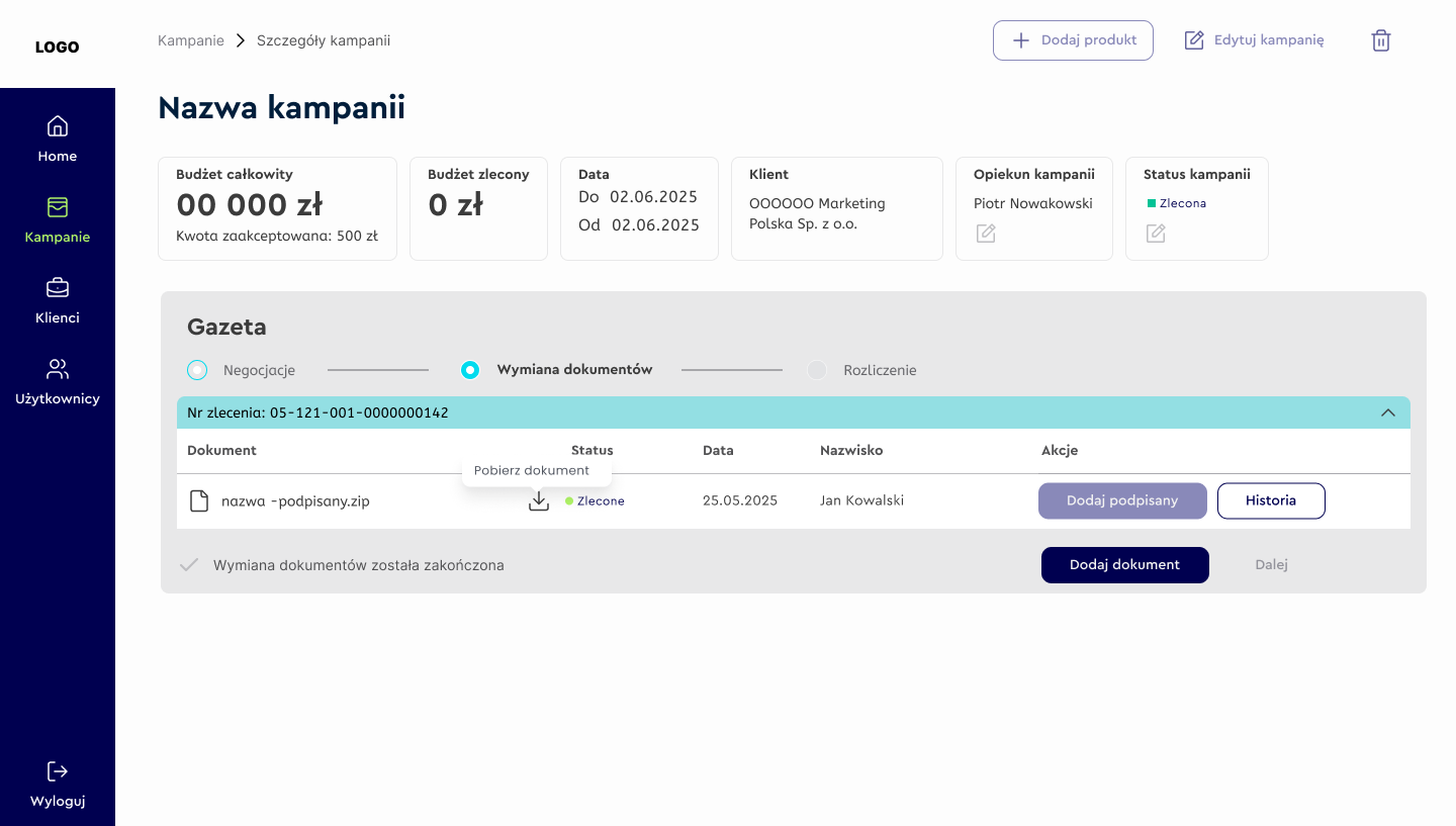
- 1Current document status
- 2Required action
- 3History on demand (separate panel)
- 4No duplicated information
EffectFull visibility of decisions without clutter, and a clear sense of progress toward completion.
A clear, scalable transaction workflow
The final solution supports complex negotiations while keeping users oriented and in control at every stage of the process.
In practice this means less backtracking, less interpreting data on one's own and a lower risk of a wrong decision, plus a faster, more confident path through each stage.
Orientation
Users understand where they are in the process.
Decision-making
Available actions are tied to the current status.
Control
Context and history are accessible without clutter.
The project ran for about 14 months, iteratively, in collaboration with the team and the developers. The redesign covered the whole transaction workflow across four user roles, three process stages and three status layers. The solutions were validated in usability testing with four planners and in ongoing consultations with the team.
Not single screens, but a change in how people work
The most important difference is not at the level of single screens, but of the whole workflow.
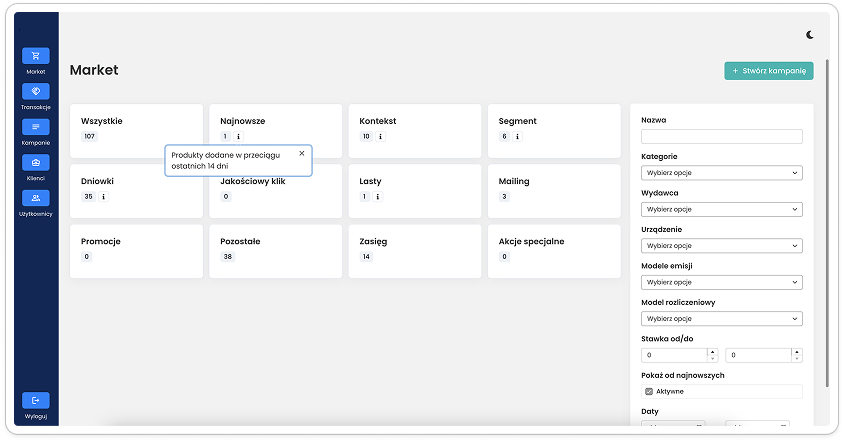
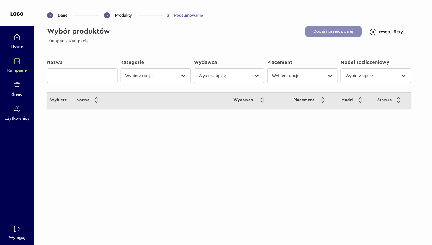
Before and after at the level of the whole view.
- Scattered actions.
- Statuses as labels.
- History mixed with the current state.
- Users interpret the process themselves.
- One end-to-end path.
- Status drives action.
- History is contextual.
- Interface answers: what's next?
Ordering complexity without hiding it
I did not remove the complexity of the process, because it came from business logic that could not be changed. I designed the interface so that the user would not have to interpret it on their own. The project showed how much cognitive load can drop when system logic and status guide the user's actions, instead of leaving them to read a complex B2B system on their own.