One communication system that guides the patient
Bringing order to the communication of Optegra's vision-correction campaign. Banners, landing page, form and information materials were meant to stop working in isolation and instead lead the patient along one clear path — from the first contact with the brand to contacting the clinic.
- Product
- Vision-correction campaign: landing page, banners and information materials.
- Audience
- A patient considering a vision-correction procedure, first contact with the offer.
- Scope of work
- Message hierarchy, landing page, path to contact.
- Role
- UI and UX support for the marketing team.
A campaign that leads to the clinic
Optegra is a network of ophthalmology clinics specialising in modern vision-correction methods. The project was about bringing order to the campaign's communication and designing materials that support the patient from the first contact with the brand to contacting the clinic.
A medical subject is complex and raises worries, and the decision to have a procedure is rarely made at once. The role of the communication was to guide the patient through that decision calmly and clearly.
My work focused on the hierarchy of the message and on consistency between the campaign, the page and the supporting materials, so that every touchpoint led to the same, clear next step.
The touchpoints worked in isolation
Patients reached the offer through different touchpoints: an ad, a landing page, a form and information materials. The challenge was to make these elements stop working separately and instead lead the user along one clear path.
- A complex medical subject that has to be explained simply.
- A need for plain language and a calm tone.
- Many communication formats to keep consistent.
- The need for a clear, unambiguous next step.
Who sees it?
A patient at first contact, often uncertain and full of worries.
Where do they land?
Ad, landing page, form and materials as separate tiles.
What next?
The next step was often unclear; contact got lost at the bottom of the page.
Main challenge: How to connect scattered touchpoints into one path that explains the offer, builds trust and leads the patient to contact the clinic without any sense of pressure.
Patient path
I designed the communication so that the patient moves through the stages of the decision without a sense of pressure and without having to hunt for the key information themselves.
- I see the messageA banner or ad catches attention and signals the offer.
- I understand the offerThe landing page explains what the procedure is and who it is for.
- Is this for me?Decision sections answer worries and the most important questions.
- I know what to do nextA visible CTA and form show one unambiguous next step.
- I contact the clinicThe form or contact closes the path and hands the patient to the clinic.
One decision path instead of scattered, independent touchpoints.
Three communication pillars
I based the communication on three principles meant to order the patient's decision and keep consistency between the campaign, the page and the supporting materials.
Instead of adding more content, each pillar decides what the patient sees first, how their trust is built and where they find the next step.
Information hierarchy
First what the patient must understand right away. The rest of the content comes later.
Trust and safety
A calm tone, plain language and no sales pressure.
A visible next step
CTA, contact and form as a natural part of the path, not an add-on at the end.
From problem to decision
The key design decisions came from the need to simplify the communication and lead the patient towards a specific action.
Digital campaign as the first point of contact
The digital campaign was the patient's first point of contact with the offer. Banners had to quickly deliver the main message and lead the user to the landing page, where the offer was expanded.
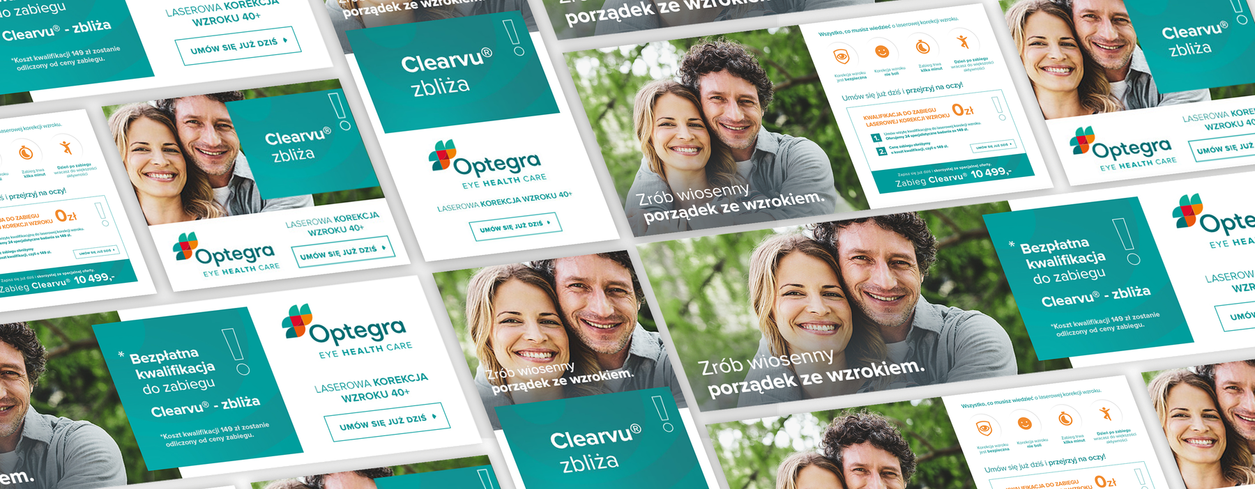
- Campaign key visual
The main motif and message that tied the whole campaign together.
- Banner set
Adaptations of the message across the digital campaign's formats.
- Consistent hierarchy
Message, branding and CTA in a repeatable layout.
Landing page as the centre of the path
The landing page connects the campaign message with a concrete action. It builds trust and leads the patient to contacting the clinic.
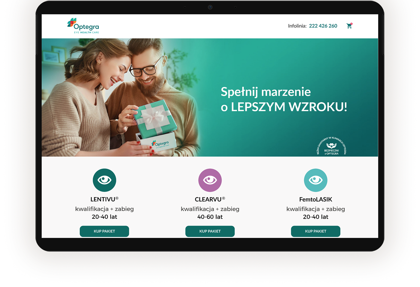
- A clear promise
The patient knows straight away what the offer is about.
- Decision sections
The content answers the key questions and builds confidence in the decision.
- Contact as the next step
The CTA and form are part of the path, always within the patient's reach.
Patient flow
A short flow shows how the user moves from getting to know the offer to taking the next step: contact or the form.
- Campaign message
- Understanding the offer
- CTA
- Form / contact
The flow focuses on a smooth transition: campaign message, understanding the offer, CTA, form or contact.
Project outcome
The project brought order to the communication between the campaign, the landing page and the information materials. As a result, the patient received a consistent path from the first contact with the brand to contacting the clinic.
Digital campaign
The first contact, which signals the offer and leads further.
Landing page
The centre of the path: it explains the offer and builds trust.
Form and contact
An unambiguous next step that closes the patient's path.