Simplifying the equipment selection and rental path
A UX/UI concept that simplifies the construction-equipment rental path. Designed mobile-first, with an extension to desktop. The goal was to shorten the route from need to reservation: from finding equipment, through conditions and location, to placing a reservation.
- Product
- A concept for a construction-equipment rental product.
- Users
- Individual and business customers looking for equipment for a specific task.
- Scope
- UX/UI audit, information architecture, flow, wireframes and UI direction.
- Project input
- Audit, client workshops, Clarity and user feedback.
A concept that orders equipment selection and rental
Rentools is a concept for a construction and technical equipment rental product, designed mobile-first, with an extension to desktop. The goal was to simplify the path from finding equipment, through checking conditions and location, to moving on to reservation.
I based the project on a UX/UI audit, client workshops, analysis of recordings and stats from Clarity, and user feedback collected by the client.
The concept was not rolled out to production. Its goal was to work out a UX/UI direction and order the key user path.
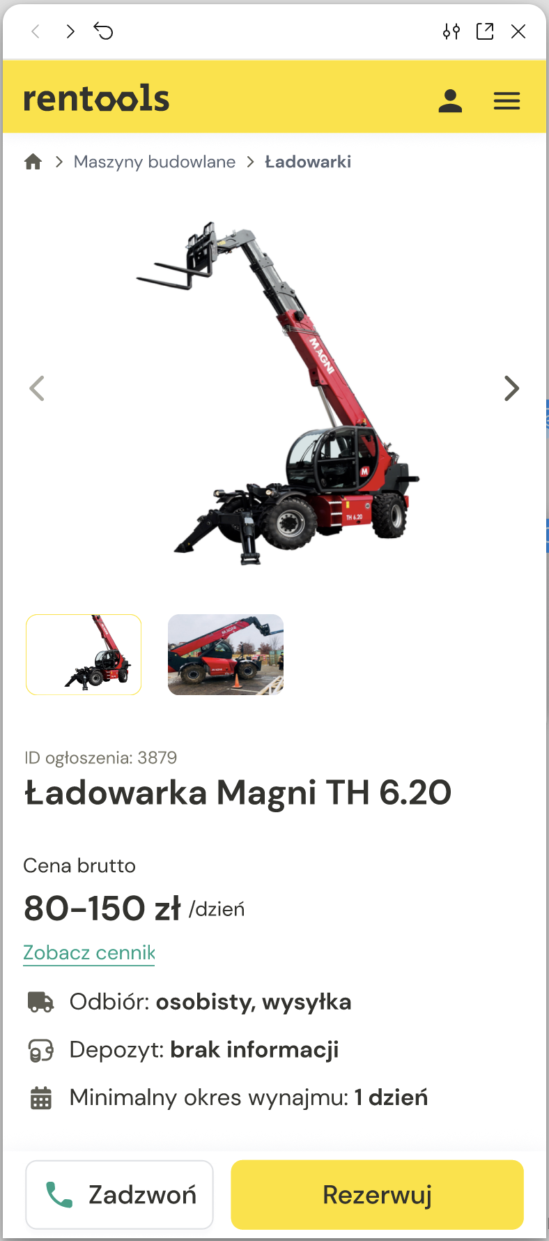
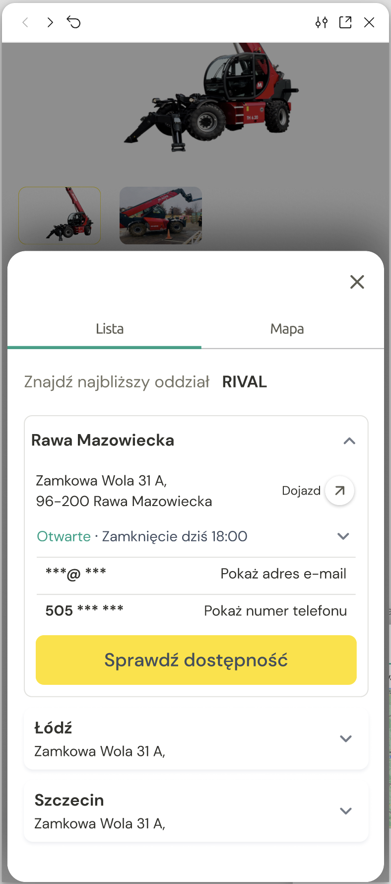
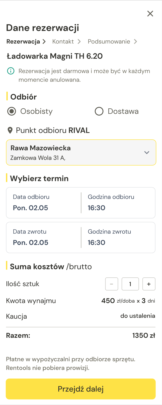
- Equipment card
- Location / rental point
- Reservation
Plenty of information, little decision confidence
The audit showed that the problem was not only the number of products, but the way the user was guided through the decision. The user had to understand not just which equipment they were choosing, but also who they were renting it from, where the branch was located, what the pickup conditions were and what actually happens after sending an enquiry.
Who rents it out?
No clear information about the rental point.
Where to pick it up?
Branches and location did not support a quick choice.
What next?
Reservation and contact needed a better-closed path.
Core challenge: How to guide the user from choosing equipment to sending a reservation enquiry, showing along the way only the information that genuinely helps them decide: conditions, the rental point, location and dates.
From audit to design decisions
A UX/UI audit, client workshops and Clarity analysis surfaced the key friction points that had the biggest impact on the design decisions.
The user decision path
Instead of an elaborate process diagram, I show the five decisions a user makes on the way to a reservation.
- NeedFrom a task or type of work to the right category.
- EquipmentChoosing a specific item based on the key information.
- ConditionsDates, price and the basic rental parameters.
- LocationWhere to pick equipment up and whether it is available nearby.
- ReservationA short confirmation and the move to renting.
A thin line of decisions instead of a heavy flow diagram.
Three pillars of simplification
I based the path on three decisions that order the entry to the offer, the equipment card and the reservation process itself.
Instead of an elaborate catalogue with many filters, the app guides the user along the shortest sensible route from need to reservation.
A fast entry to the offer
The user can start from categories, search or location, depending on whether they know what they are looking for.
The equipment card as a decision aid
The most important information is visible at once: name and rental shop, price, availability, location, key parameters and contact.
A short reservation path
The rental process is limited to the key decisions: choosing the equipment, dates, location, contact details and confirmation.
Restructuring the product card
The biggest change concerns the equipment card. It decides whether the user understands the offer and moves on.


- The rental shop's name and profile visible at once.
- Information ordered by decision priority.
- A clear date choice and an unambiguous contact.
- Technical parameters available, but not blocking.
Not a redesign of the whole product, only a restructuring of the equipment card.
Key design decisions
Every decision came from real user problems and was translated into concrete solutions in the interface.
The rental shop as part of the decision
The rental shop was treated as a permanent element of the product card, not a side note hidden lower in the process.
In a marketplace model the user needs to know which company they are renting from and who is responsible for pickup and contact.
The name, logo, branches and a link to the rental shop's profile help make a decision without hunting for context.
The map as availability support
The map and the list of branches were connected with availability, so the user can quickly judge where they can realistically pick equipment up.
When renting equipment, location is part of the decision. A map alone, without the context of the branch, contact and availability, does not solve the problem.
The user compares branches, sees availability and can move on without leaving the path.
The product card as the decision hub
The key decision information was moved higher up on the product card: price, terms, deposit, minimum rental period, rental shop and CTA.
The user should not have to scroll for long to understand whether the equipment fits their need and what they can do next.
The product card leads from recognising the equipment to a decision about contact or reservation.
A short reservation path
The reservation process was split into a few simple steps: choosing the terms, contact details, a summary and confirmation.
The user needs to know what happens after sending an enquiry and whether the reservation was actually passed on to the rental shop.
The process ends with a clear message that closes the path and reduces the user's uncertainty.
Desktop as an extension
The mobile direction carries over to desktop without changing the logic. More space, the same decision path.
On desktop the equipment list, the product card and the map can coexist in one view, but the information hierarchy and the order of decisions stay the same as on mobile.
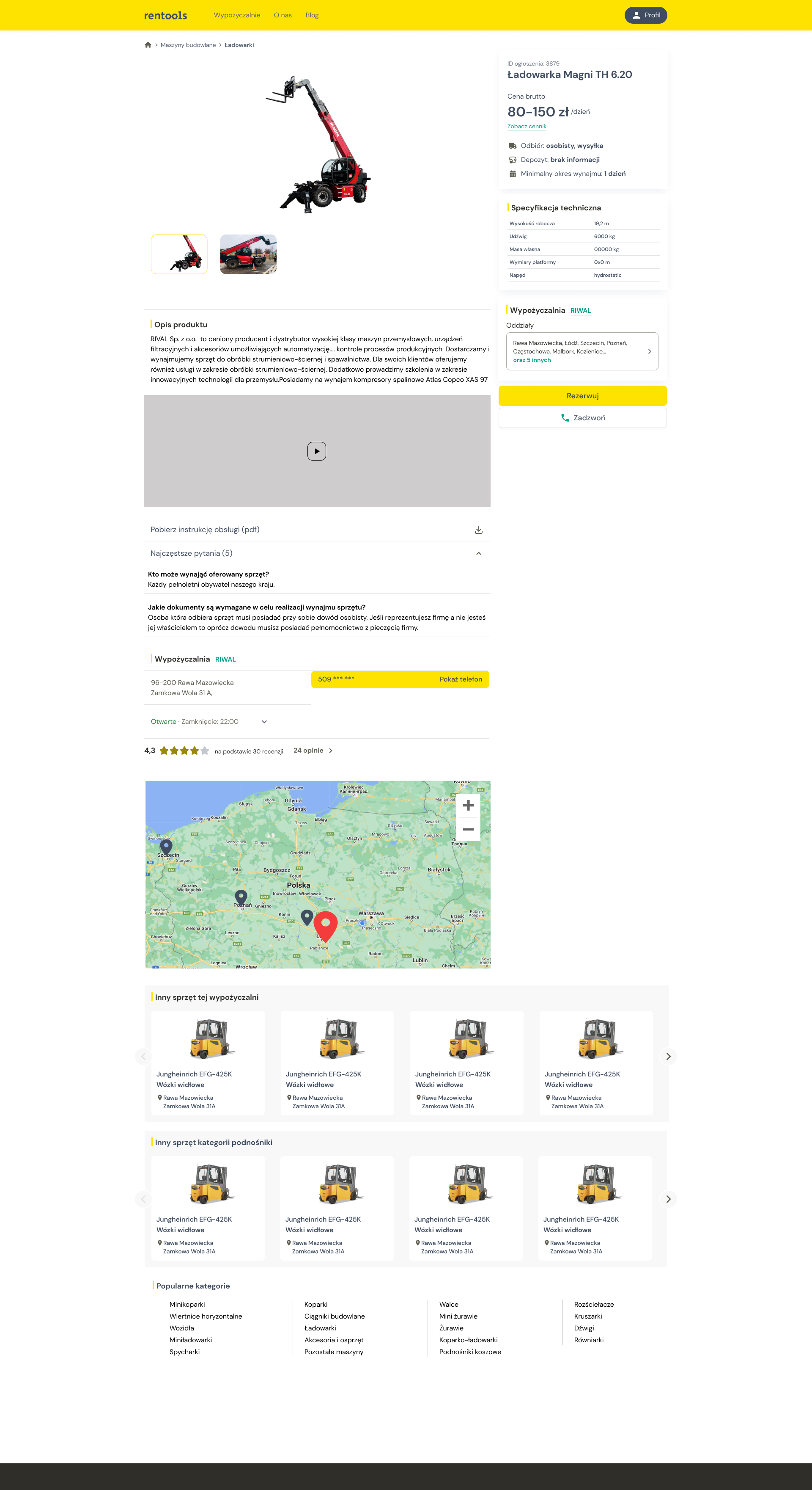
Outcome: the path from choosing equipment to reservation
The outcome of the concept is an ordered, mobile-first path that leads the user from the product card, through choosing the rental shop and branch, to sending a reservation enquiry.
- Product card
- Rental shop / branch
- Reservation details
- Confirmation
Limitations & next steps
- Validating the decision path with users.
- Refining the filtering and search logic.
- Testing the reservation form.
- Checking which technical parameters actually help the decision.
The project ended at the UX/UI concept stage and was not implemented. The next steps would run from validating the path with users to refining the details of the process and preparing the desktop views.