Wiraż Cycling Club
A mobile app that brings training sign-ups, payments and club communication into one clear place.
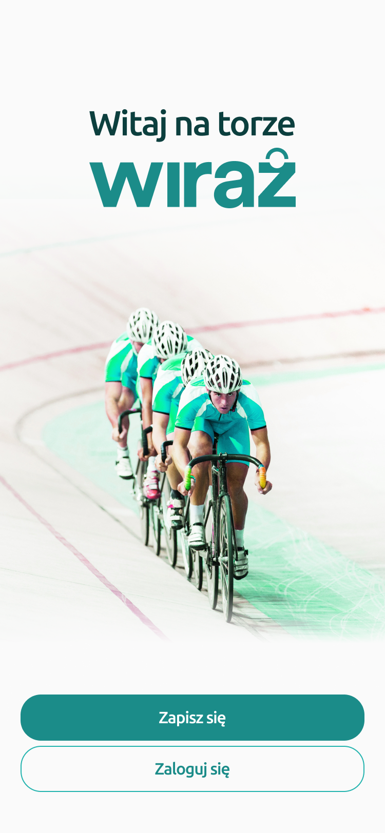
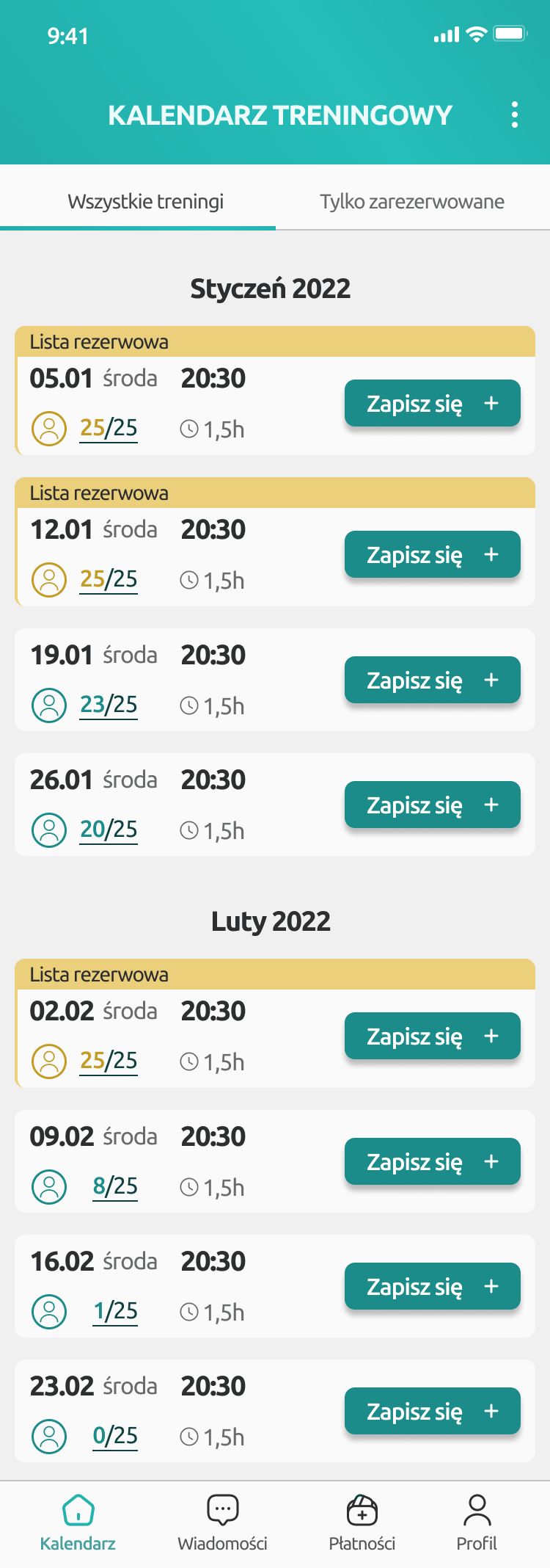
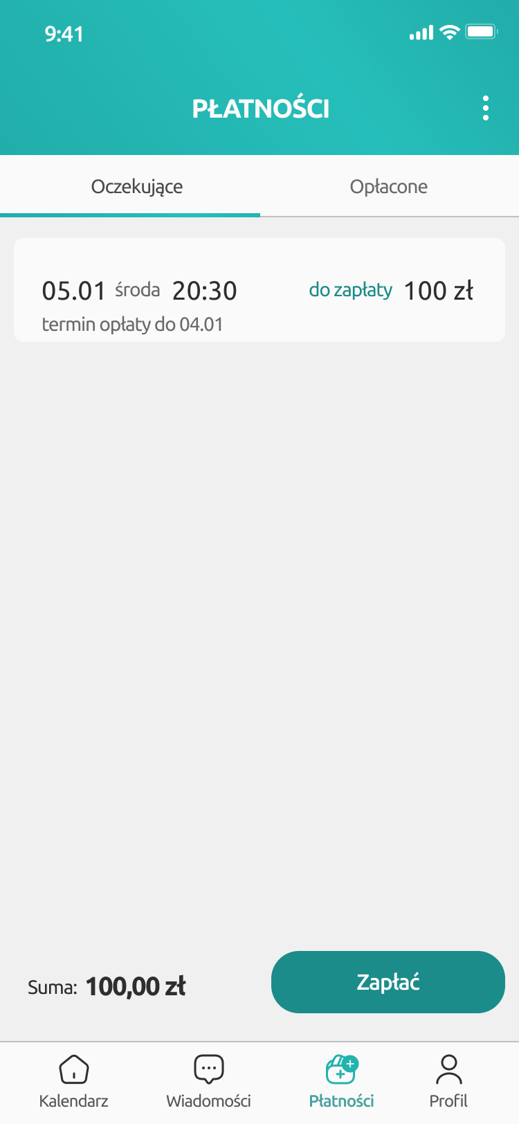
- Product
- A mobile app concept for a cycling club.
- Users
- Club members regularly signing up for training sessions and events.
- Scope
- Task analysis, information architecture, flows, wireframes, prototype and UI direction.
- Core need
- One place to check the schedule, sign up, cancel attendance and control payments.
From scattered tasks to one app
- schedule in a separate place
- payments outside the path
- scattered announcements
- one app
- clear status
- predictable confirmations
One app for everyday club-member tasks
Wiraż is a cycling club organizing training sessions, events and activities for its members. Daily use of the club offer meant checking the schedule, signing up for sessions, keeping track of payments and following organizational messages.
The app concept was meant to bring these actions into one place and create a simple, repeatable path for active club members.
The scope was conceptual. The key goal was to order the tasks, show status after actions and design an interface that does not require extra explanation.
What the app needed to connect
Training
Sign-ups
Payments
Communication
Being part of the club was not complicated. Managing it was.
The biggest friction did not come from the club activity itself, but from the tasks around it: sign-ups, confirmations, payments and communication.
No single place of control
The user had to check the schedule, sign-ups and payments in different places, which increased uncertainty and the number of follow-up questions.
Uncertainty after an action
After signing up or cancelling attendance, the user needed a clear signal that the action had been completed correctly.
Payments outside the path
Payment status was not visible in the sign-up flow, so users had to track due payments and rules on their own.
Core challenge: How to design a simple club app that combines schedule, sign-ups, cancellations and payments without adding another layer of organizational noise.
Two flows that defined the app's usability
The concept focused on the paths users repeat regularly: signing up for a training session and cancelling attendance. These had the biggest impact on the feeling of control and the speed of using the app.
- Calendar
- Session details
- Sign-up confirmation
- Payment status
Main path: the user checks upcoming sessions, chooses a date, confirms attendance and sees the payment status.
Cancelling attendance
- My sessions
- Cancel attendance
- Confirmation
The second flow is shorter, because the user should be able to cancel quickly and immediately see the change confirmed.
From problem to design decision
The most important design decisions came from one simple question: what does the user need to know to take the next action without hesitation?
01 / Starting point
Calendar as the starting point
Problem: The user most often started with the question of when the next training session was happening.
Decision: The schedule became the main entry point to the app, because most actions begin with choosing a date.
- 1Upcoming dates
- 2Availability status
- 3Fast entry to details
- Schedule as separate information
- No clear entry to sign-up
- Decision split across several steps
- Upcoming sessions list
- Date and group visible at once
- Fast move to sign-up
EffectThe key information is visible immediately, and moving to sign-up does not require searching.
Callouts: date · group · available spots · sign-up status
02 / Feedback
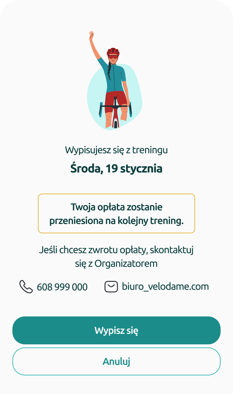
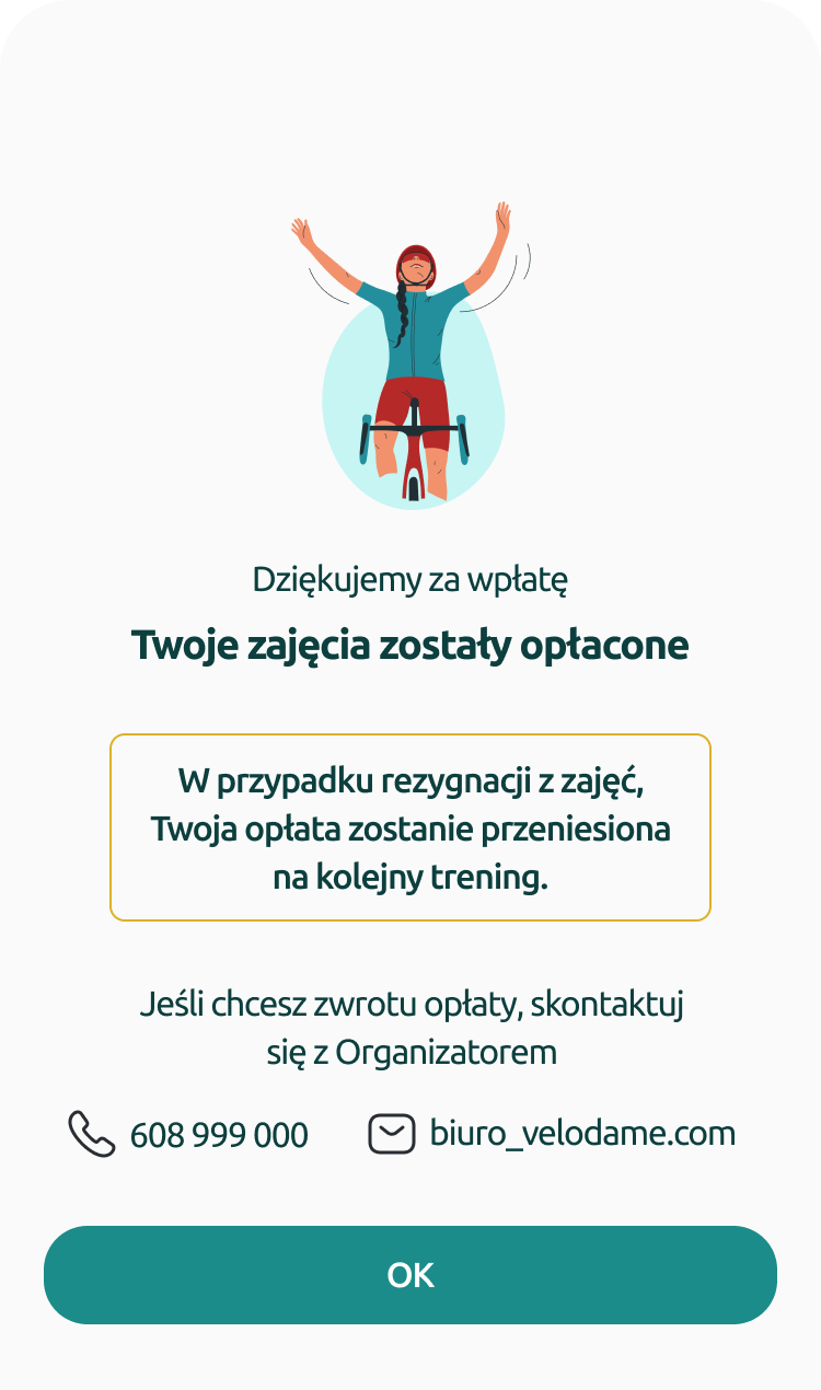
Confirmation after every important action
Problem: A lack of clear feedback created uncertainty after signing up or cancelling attendance.
Decision: Every key action ends with an explicit message that closes the process.
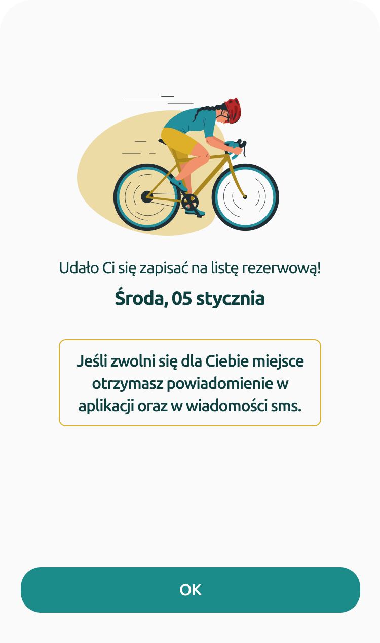
- Action without closure
- Uncertainty after tapping
- Follow-up questions to the organizer
- Sign-up message
- Cancellation confirmation
- Clear next step
EffectThe user understands what just happened and whether anything else needs to be done.
Callouts: sign-up confirmed · attendance cancelled · payment confirmed
03 / Payments
Payments as part of the path
Problem: The user had no clear view of whether a session was paid for or required another action.
Decision: Payment status was connected to training attendance and made visible without extra searching.
- 1Payment status
- 2Items requiring action
- 3Payment history
- Payments outside the process
- No status preview
- Need to track rules manually
- Visible payment status
- List of due items
- Confirmation after payment
EffectDue and paid items are clear, and payments do not fall outside the main app path.
Callouts: due payments · paid sessions · empty state
Final app concept
The final concept combines the most common club-member actions in one app: training schedule, sign-up, cancellation, payments, notifications and user data.
The training list lets users quickly check the date, group, available spots and possible action.
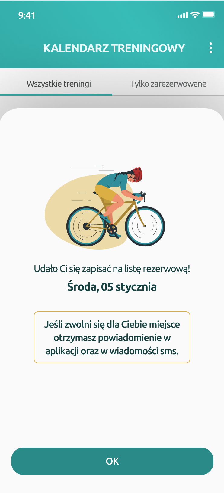
Confirmations close sign-up, cancellation and payment, so users know exactly what just happened.
The payment view shows which trainings require action and which have already been paid.
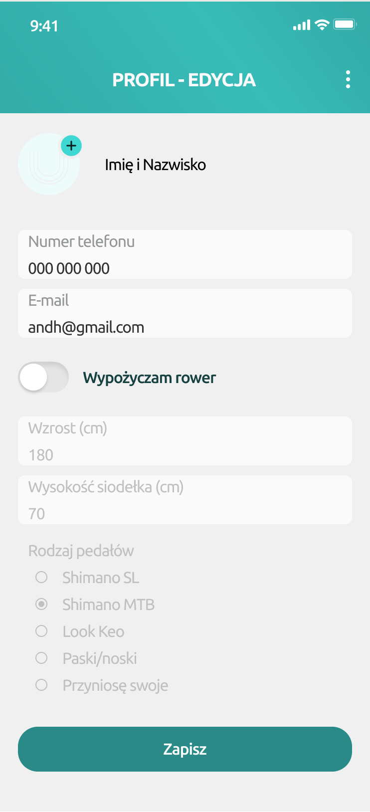
Profile, notifications and empty states support calm app use outside the main sign-up path.
The layout shows the key app screens that organize sign-up, feedback, payments and daily use.
Main user path in the prototype
The recording shows the club member's main actions: checking trainings, signing up, confirming an action and reviewing payment status.
Concept outcome
The concept ordered the most common club-member actions into one predictable path. The user can check sessions, sign up, cancel attendance and verify payments faster, without switching between tools.
Faster training sign-up
The most important path was shortened to a few clear steps.
Less uncertainty
Confirmations after actions help the user understand what has just happened.
Better payment control
Payment status is visible in the app, and due actions do not require extra contact.
Next steps
The project ended at the interaction concept stage. The next step would be to test the main sign-up and cancellation paths with club members, refine payment scenarios, expand organizational messages and validate the app with different club-user roles.